
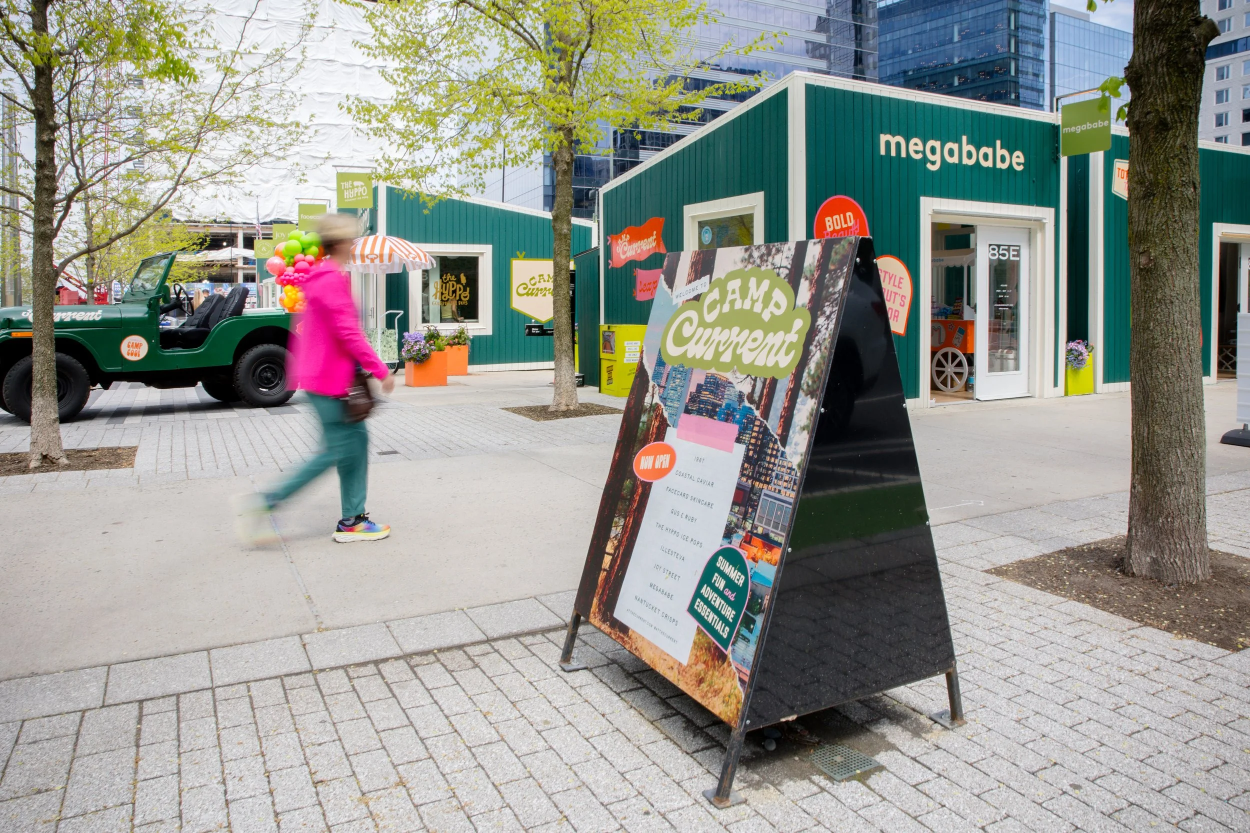

the current Spring/Summer 2025
A seasonal branding and environmental design project for nine tiny home retail pop-ups in Seaport.
Each season, Seaport transforms its retail pop-up village with a new theme, reimagining nine tiny homes as a curated shopping destination. For Spring/Summer 2025, I led the creative direction for Camp Current — from brand identity through to the physical design of the homes and a fully integrated campaign.
My role spanned the full arc of the project: developing the season's brand identity (logo, color palette) alongside our copywriter, directing the look and feel of the homes (paint color, facade design), and building out an integrated campaign to bring the concept to life across every touchpoint.




The Facades
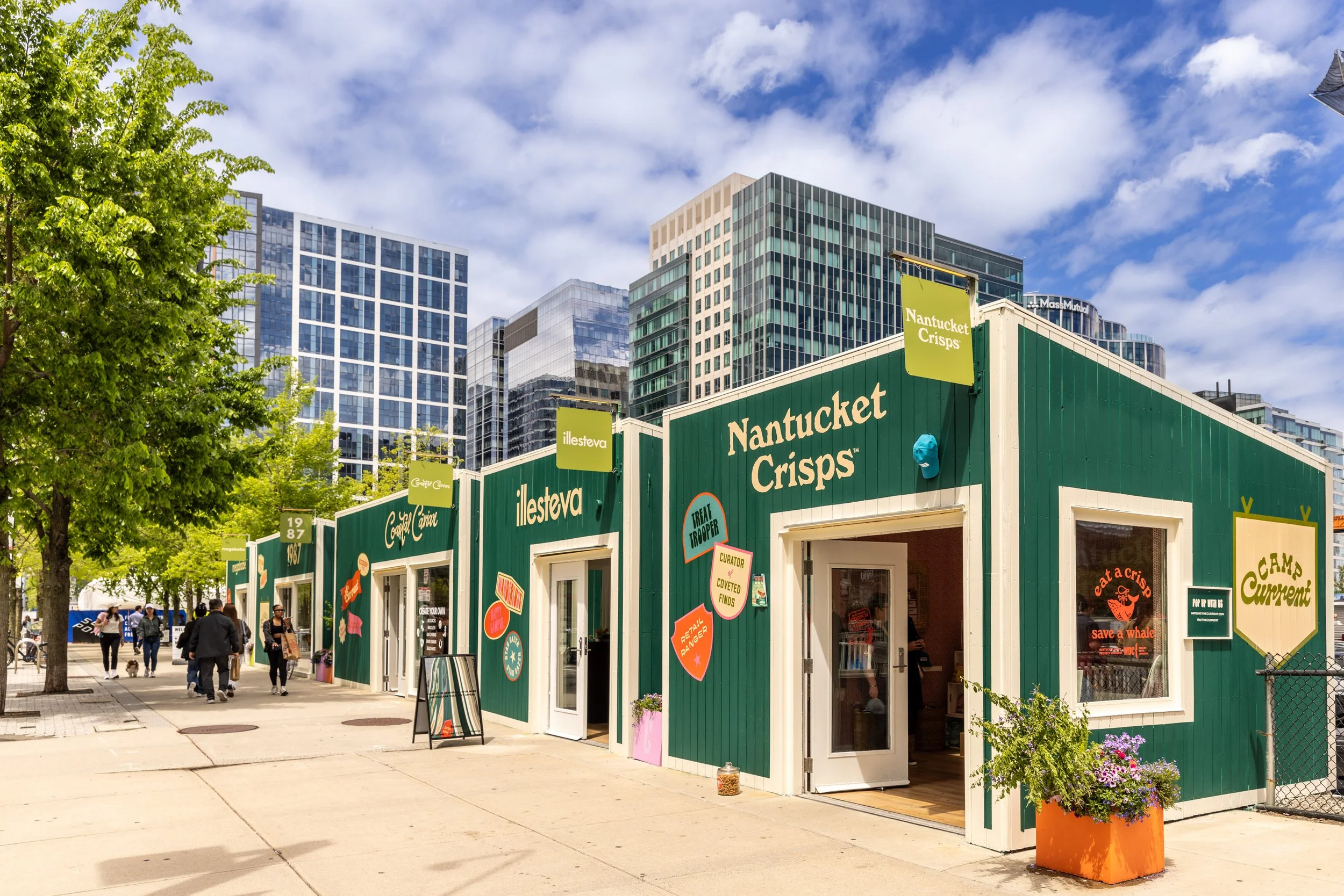
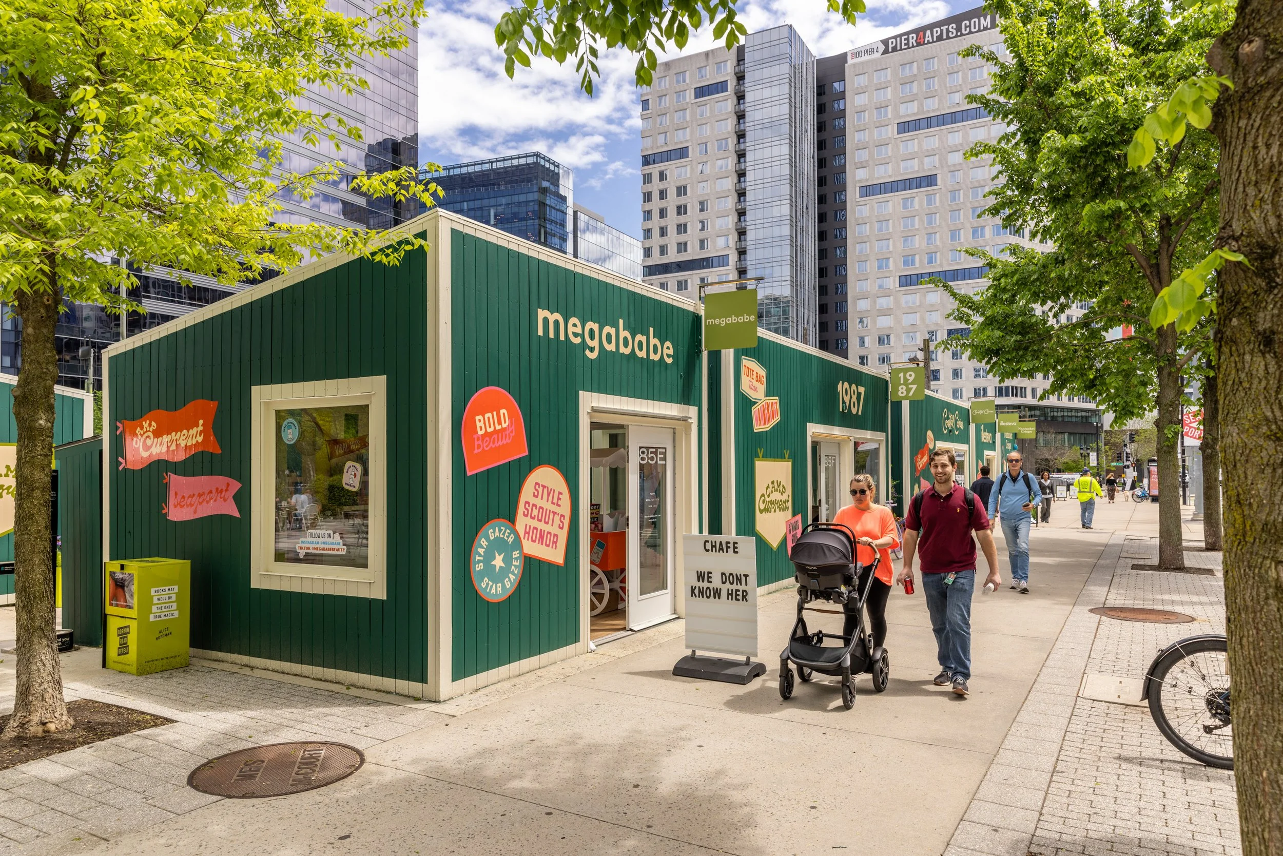
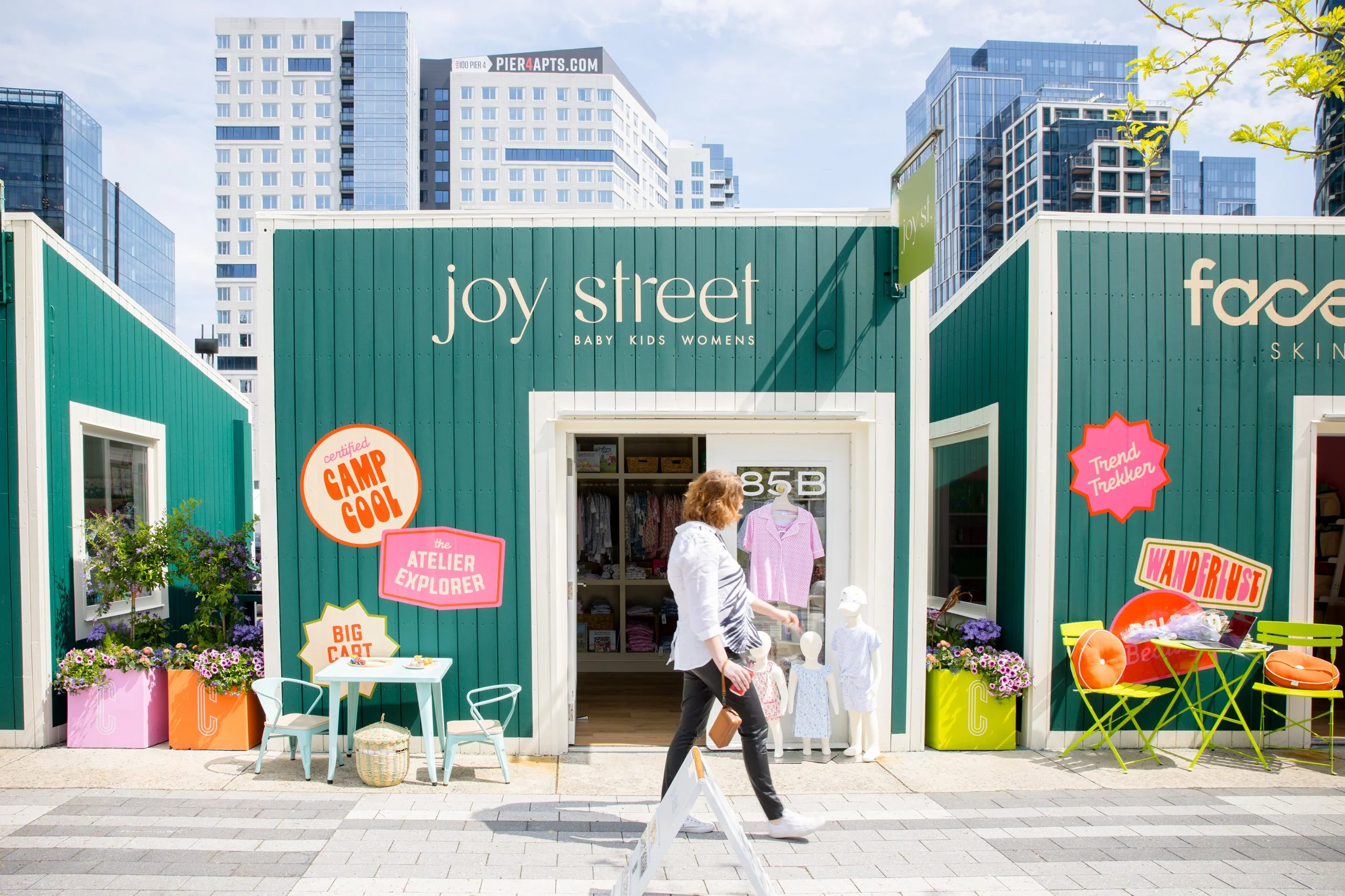
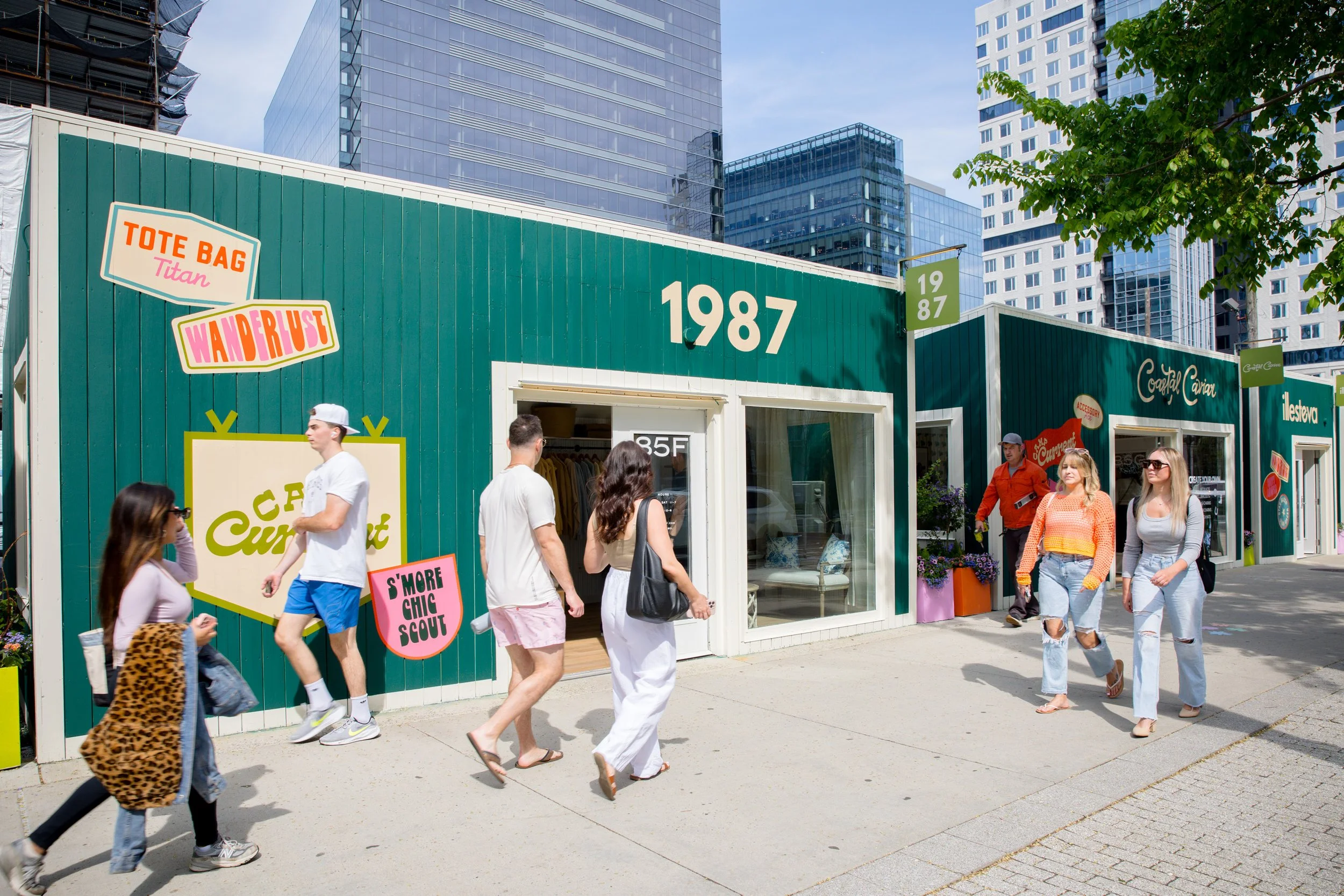
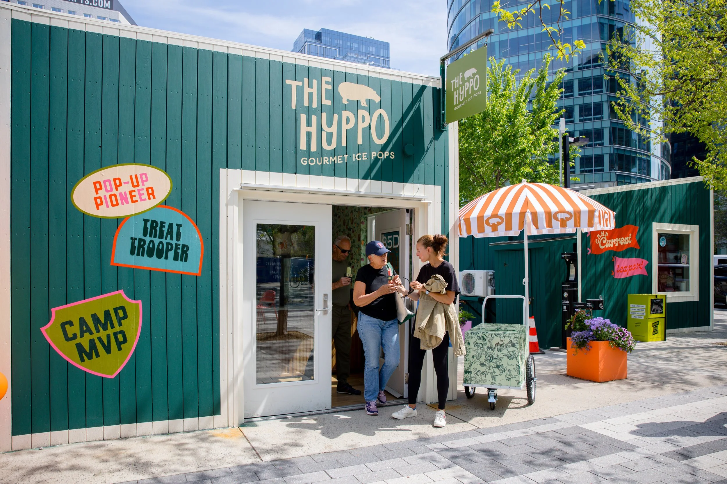
To bring the Camp Current concept into physical space, we reimagined the nine tiny homes as a modern take on classic camp architecture:
Dark green exteriors with bright off-white trim, evoking the charm of a classic camp cabin
Light green blade signs adding a playful pop of color against the deeper palette
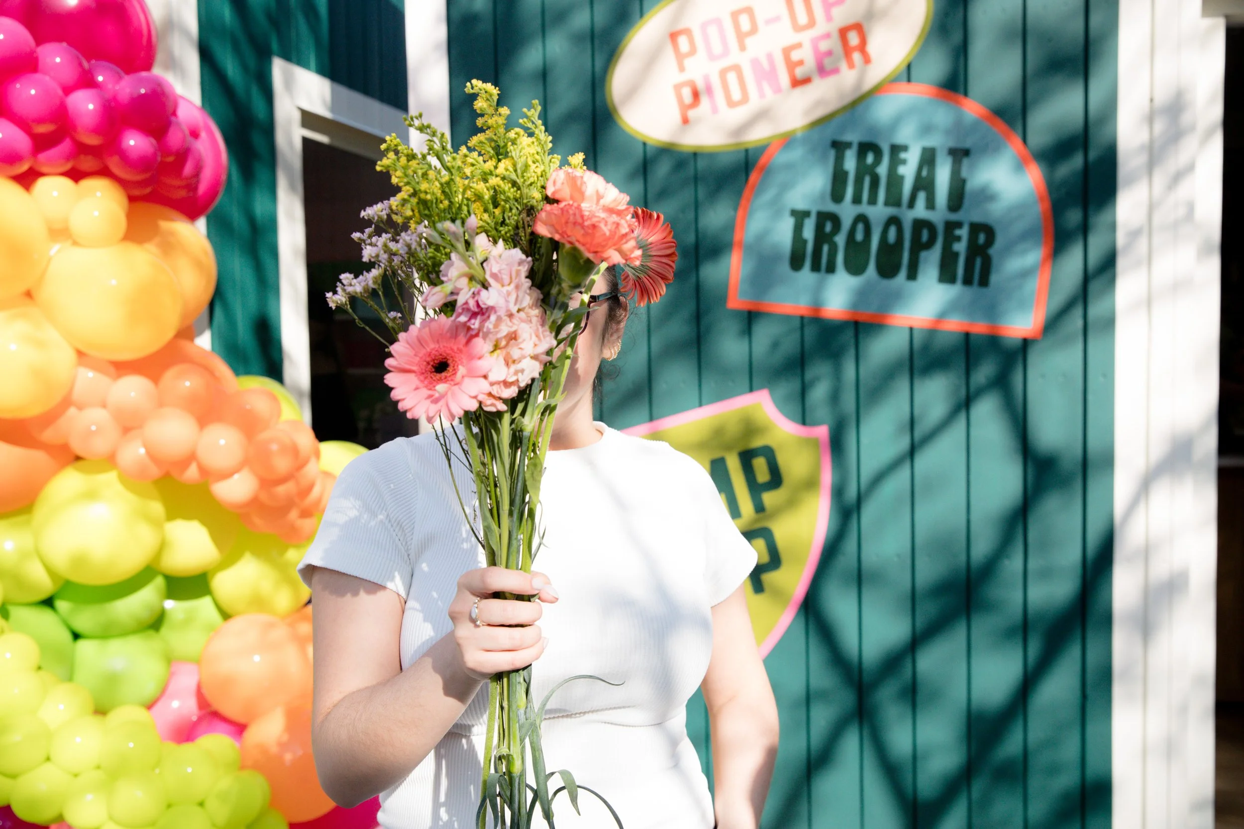
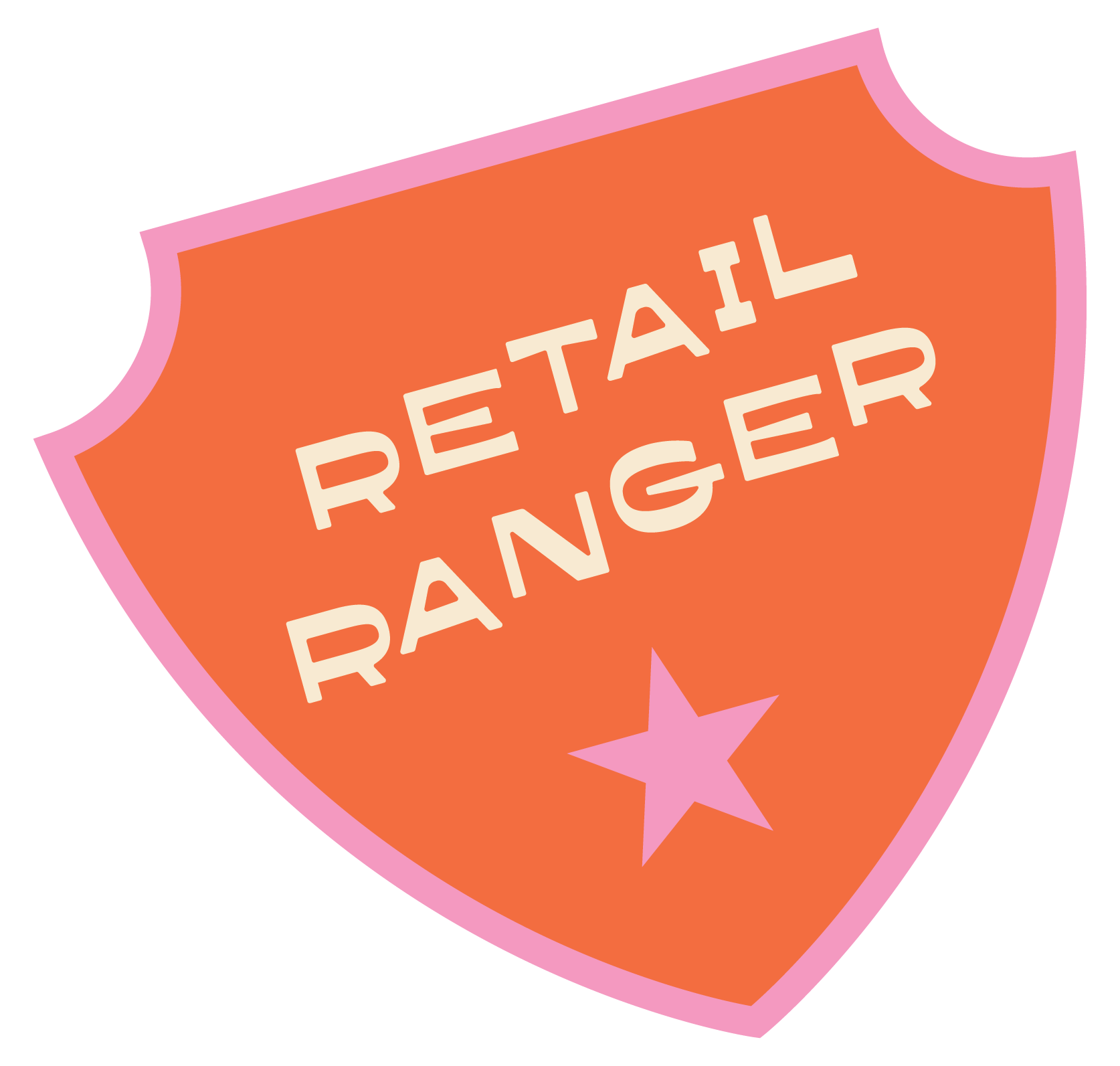
Pennant flag signage & whimsical "merit badges" peppered throughout the homes for extra character, color, and charm
Together, these elements struck a balance between nostalgic summer-camp warmth and the elevated, polished feel the Seaport audience expects.

the campaign
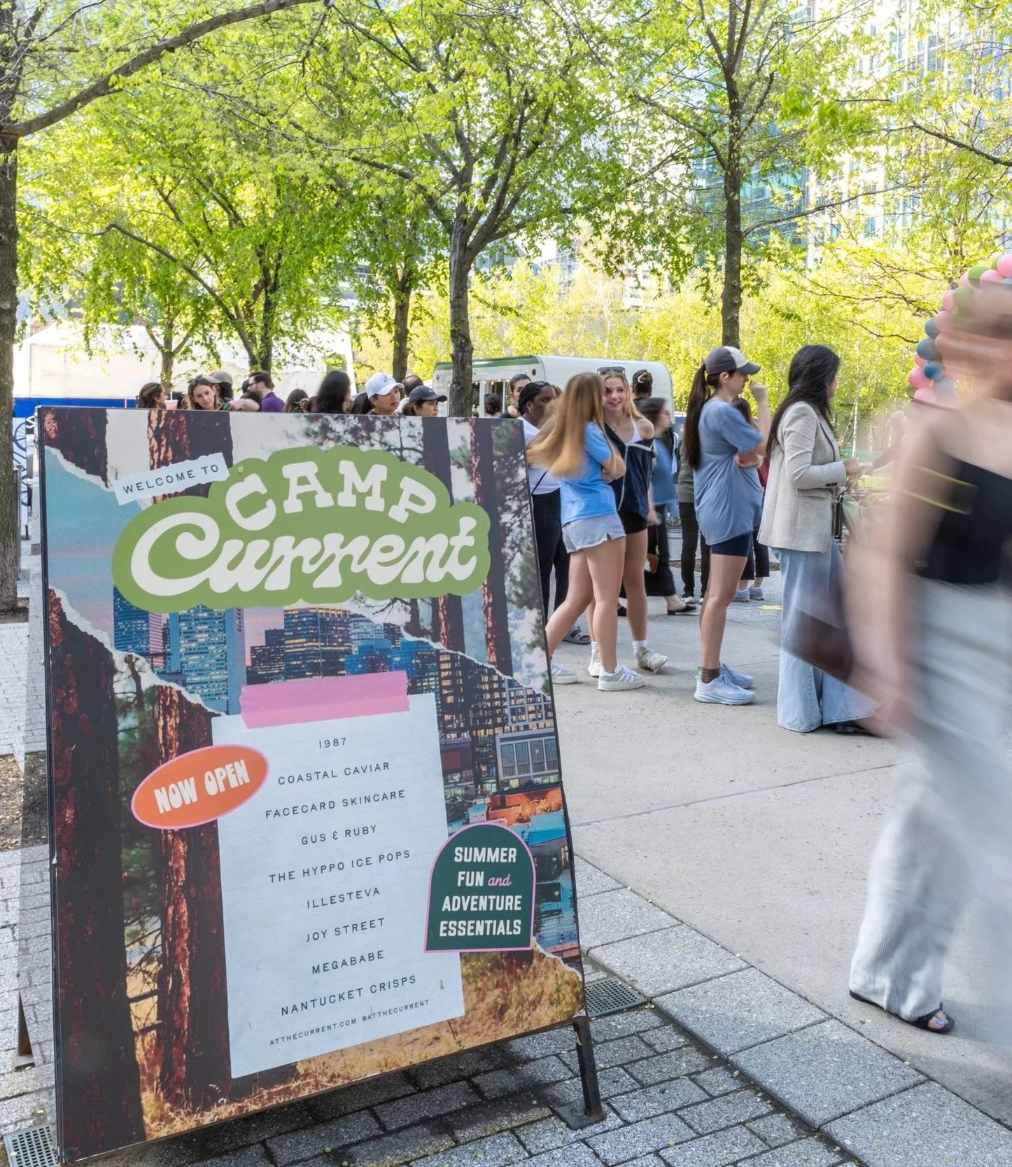
Beyond the homes themselves, the Camp Current identity extended into a full campaign — carrying the brand's color palette, logo, and voice across marketing touchpoints to create a cohesive, immersive experience for shoppers from first impression to final visit.
Nature photography, was layered with shots of Seaport's own skyline nestled at the center, grounding the camp fantasy in the reality of the destination. Torn-paper, added texture, and badge elements with funky lettering carried that tactile, collaged feel across every touchpoint.

Created in collaboration with WS Development