

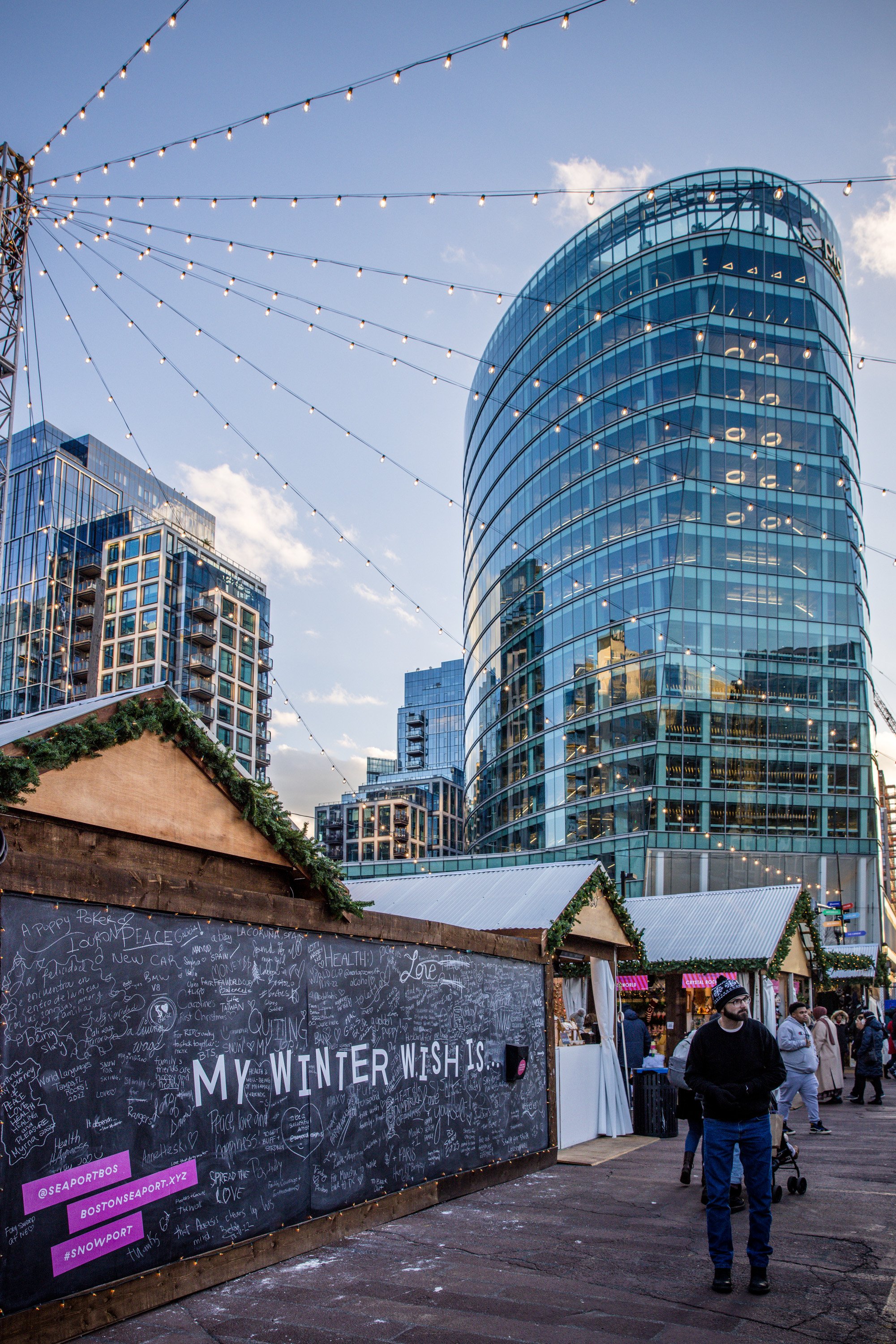
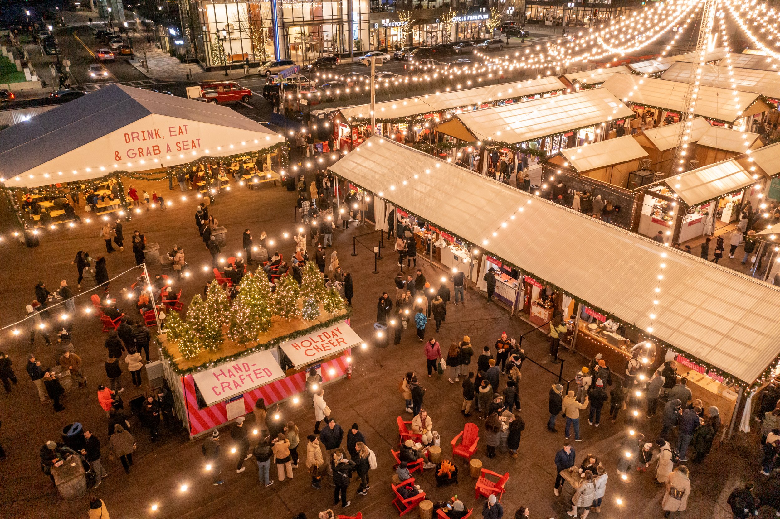
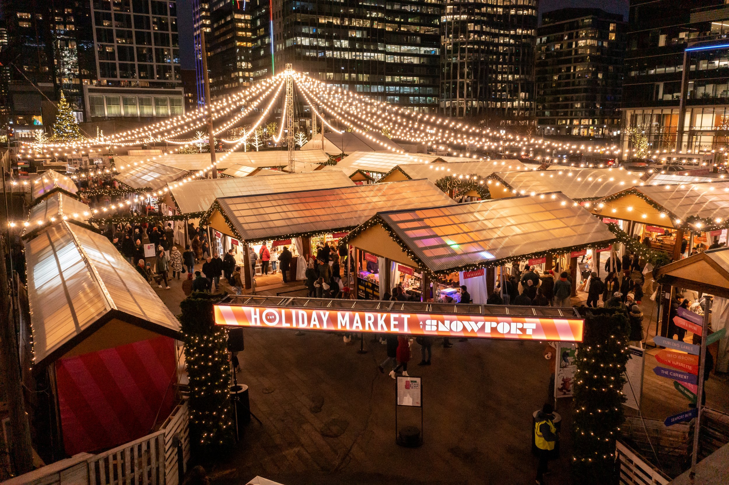
Featuring 120+ talented makers and a host of winter-themed activities, The Holiday Market at Snowport becomes the heart of the seasonal transformation in Seaport, affectionately known as Snowport. In close collaboration with our Copywriter, Creative Director, and Field Marketing teams we meticulously crafted every aspect, from branding and art direction for on-site decor to the development of digital and print marketing materials, advertisements, swag, and environmental signage.
When conceptualizing the branding and design for the market, our goal was to create something fun and fresh, resonating with the urban landscape and the cutting-edge vibe of the neighborhood while maintaining a warm, inviting, and unmistakably holiday atmosphere.

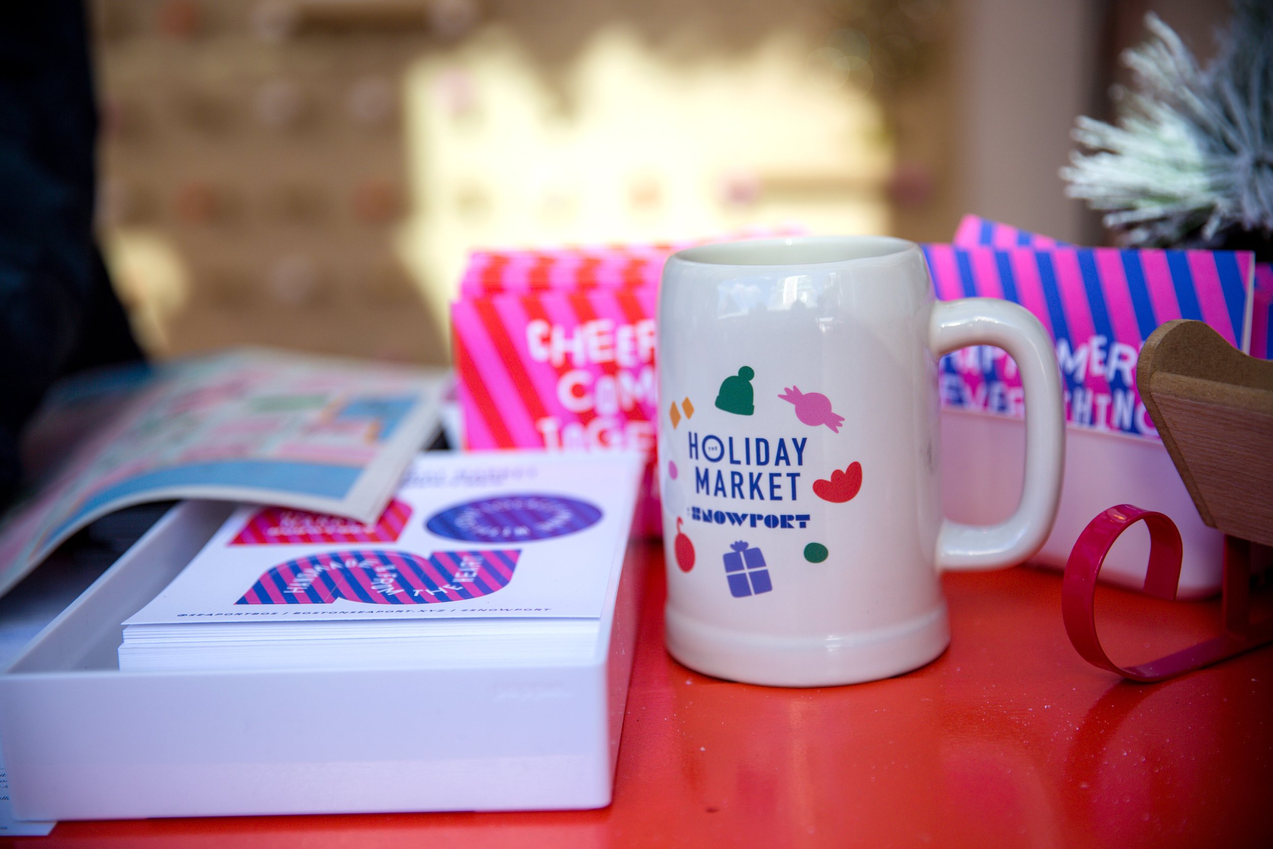
While we wanted this market to have its own unique identity, we also wanted it to feel related to the Seaport branding as a whole. Pairing Seaport brand typefaces with our existing Snowport logo gave us the perfect balance that we were looking for. Alongside the primary logo, we've developed a range of alternate versions that can be used as needed, from environmental signage to swag.

In selecting typography, our goal was to strike a balance between aligning with the established Seaport brand, and adding a touch of something slightly elevated. For our headline font, we drew from our Seaport brand fonts, ensuring a seamless connection. For the supplemental fonts, we allowed for more creative freedom. Our subhead font gives us movement and character, while our body copy imparts a soft, romantic touch. The balance and duality of the two perfectly capture the holiday season in Snowport.


As mentioned previously, we wanted this branding to align with the urban landscape and cutting-edge feel of the neighborhood. With this in mind we opted to go for a bright and punchy holiday palette.

To pay homage to the diversity of makers within the market, we chose multiple design directions for our graphic elements. Firstly, we incorporated organic shapes, which appear on signage and various collateral pieces. Then, we introduced diagonal stripes, inspired by classic wrapping paper, creating a vibrant and eye-catching pattern that adorns the entire market. Lastly, we featured character illustrations, though their use is more limited, primarily reserved for maps and occasional printed materials.


Press:
Seaport To Transform Into Holiday Snowport, Boston Globe | Eight Boston Area Holiday Markets to Shop This Month, Boston Globe | 6 Holiday Markets in Boston That Will Make You Feel Giddy and Gleeful, Boston Uncovered | 11 Best Boston Winter Holiday Christmas Markets 2022, Time Out
Created in collaboration with WS Development