
Menagerie Training Co. is a Vermont-based dog training practice led by Lauren, whose work ranges from brand new puppies to some of the toughest behavior cases around. The identity needed to hold two things at once: warm and bright enough to feel approachable, and grounded enough to reflect the real expertise behind her work.
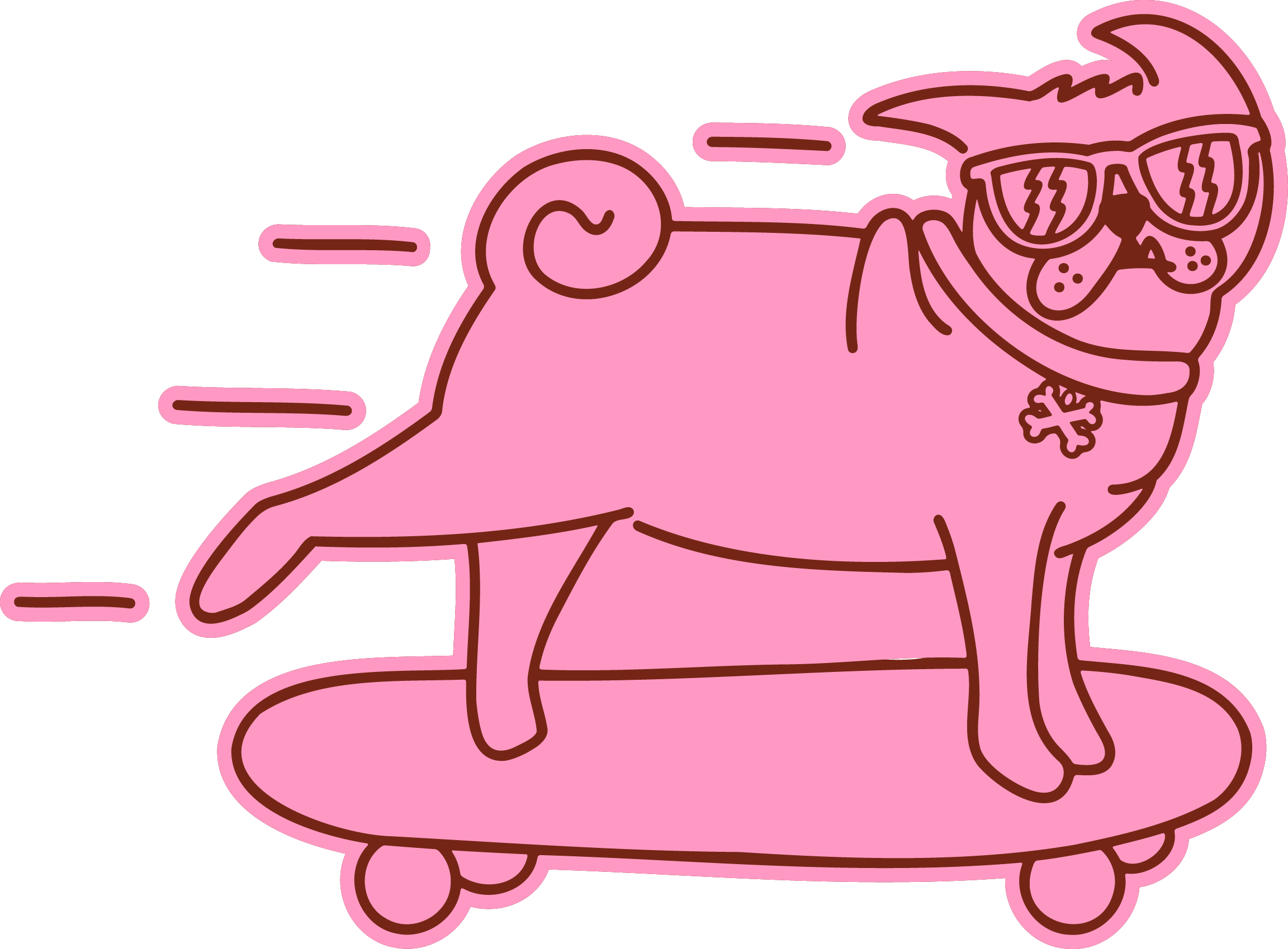
Lauren wanted a brand that felt like walking into her house: vintage, thrifted, and full of character. She wanted her own menagerie in the mark, including her cat Pearl, her pug Bad Boi Bert, and Gilligan, a parrot who's been with her for over four decades. Above all, she wanted something unlike every other trainer's logo, which in her own words she described as “pretty lame to be frank.”
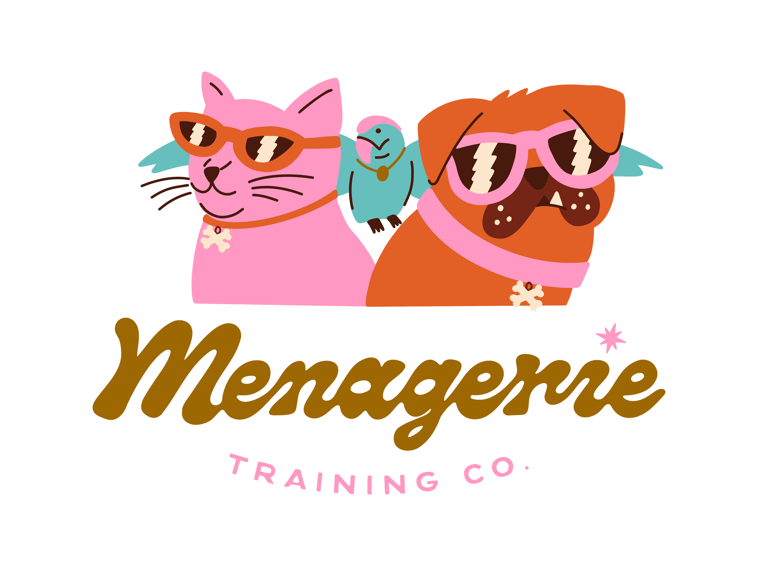
Instead of a generic dog-and-leash mark, we built the identity around Lauren's actual animals, drawn with personality. The trio appears together in a lineup that reads more like a crew than a mascot, funky and a little rebellious in the best way.
The hand lettering carries the vintage, collected-over-time quality Lauren described, loose and irreverent without losing legibility. The colors give the brand its mid-century warmth while standing apart from the neutrals typical of the pet industry. Small details, like the bone charm and the lightning bolt reflected in the sunglasses, reflect back to Menagerie's tagline of "we're all a little feral here."
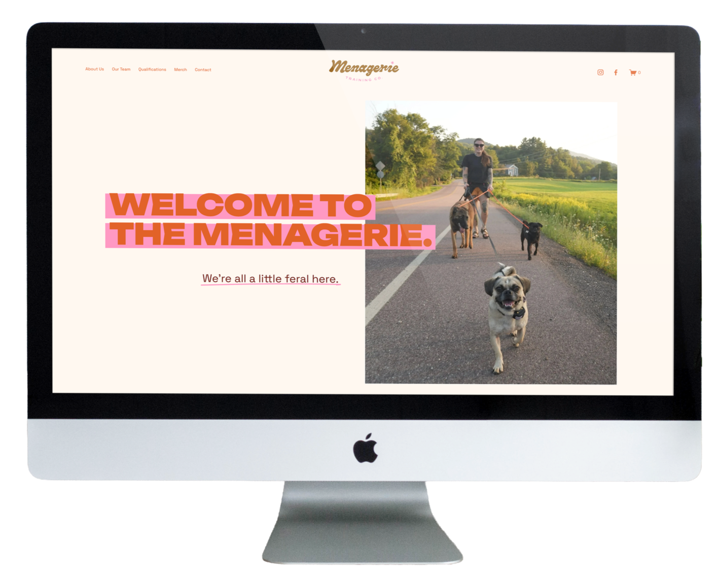
beyond the logo
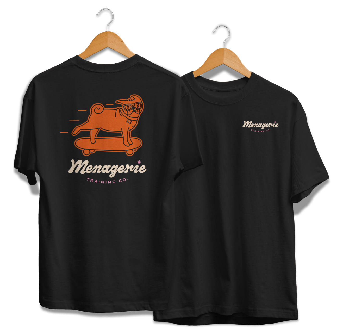
The identity extended past the mark itself into a merch and website design, giving Lauren a consistent presence wherever people find her.
The finished identity is bright, warm, and genuinely unlike anything else in the local training space, a brand that feels as unique and full of character as Lauren and her own menagerie.